
Logo design: The Color of Money

The LogoDek Silent Signals survey found results that align with decades of research in color psychology. Black and blue are the most trustworthy logo colors. But do the results stand up in the real world?
Blue, in particular, has long been associated with stability and reliability, think banks, healthcare providers, and tech companies. Black conveys strength and authority, which can also inspire confidence when used well. Interestingly, the survey also highlighted the role of cultural context. For example, respondents in East Asia consistently rated red more positively, connecting it with prosperity, celebration, and luck. This contrasts with Western associations, where red is often linked to urgency, passion, or danger.
What the Real World Says
We reviewed three major sectors - healthcare, finance and tech - traditionally known as being both conservative, and the most profitable, to see if blue really is the color of money.
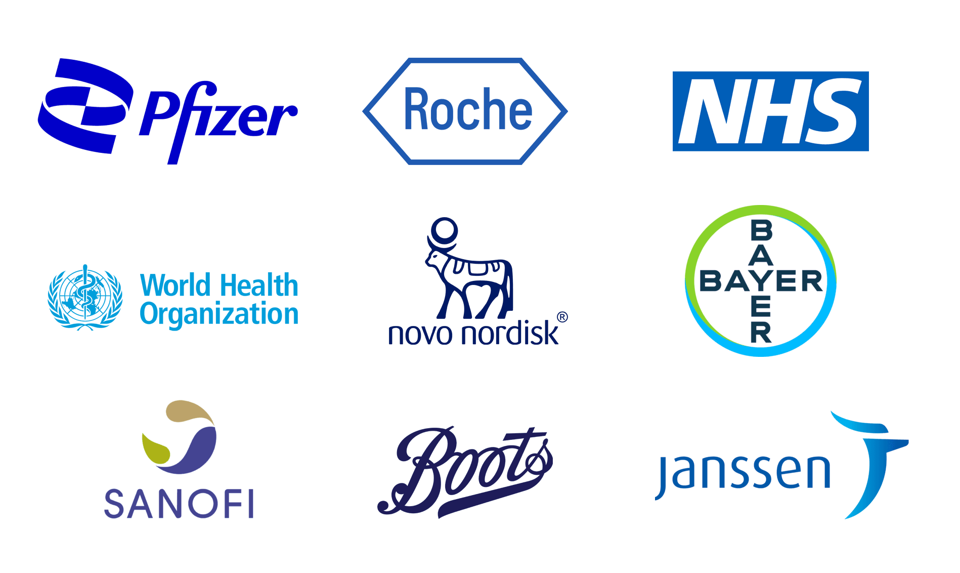
Healthcare
In the healthcare sector, a clear pattern emerges, the world’s biggest healthcare brands overwhelmingly choose blue as their primary brand color. With its associations with trust, reliability, and calm, this is no surprise. A few companies add cooler shades like green, which perhaps convey wellness, and growth. Unsurprisingly, black, due to its associations with mourning and death is avoided, as is red for obvious reasons.
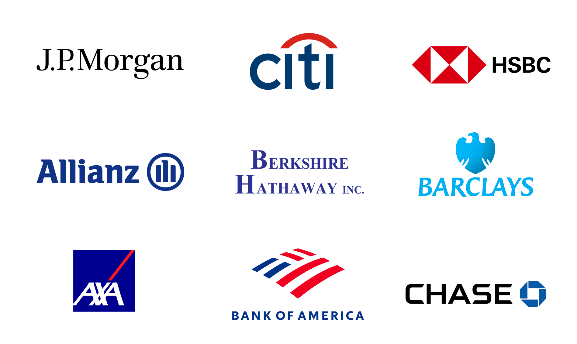
Finance
The second sector we looked at was finance. Here again, blue dominates but black is also a popular choice, reinforcing messages of stability, professionalism, and trustworthiness. However, unlike healthcare, we did see flashes of red in some of the world’s most recognizable finance brands. In these cases, the red reflects the colors of their national flags, associating the institutions with patriotism and national identity.
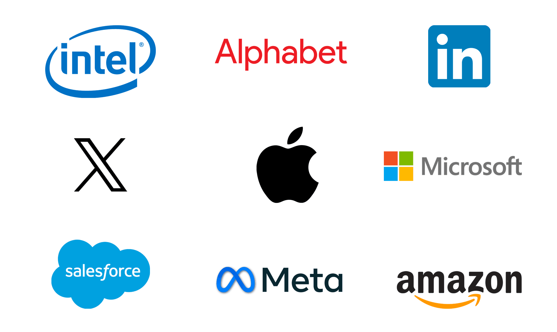
Technology
Finally, we looked at the tech industry. Blue and black are still the dominant choices here, projecting authority and trust in a fast-moving sector. But technology is also known for innovation and rule-breaking, and a few of the biggest players do just that. Alphabet and Microsoft both use vibrant multi-color palettes that signal diversity, creativity, and openness. Amazon, while sticking with a primarily black logotype, introduces a flash of orange in its iconic arrow, adding warmth to an otherwise bold mark. These exceptions remind us that while conventions shape industries, sometimes it pays to standout.
Conclusion
In healthcare and finance, blue is the color of money. Whether it’s caring for patients or safeguarding investments, blue communicates reassurance and stability. In finance, black takes a strong second place, reinforcing authority and professionalism, while selective touches of red bring energy or a nod to national identity.
In the tech sector, the rules are looser. Blue and black are safe bets but some brands defy convention to express creativity and warmth. Microsoft, often seen as a more traditional player, uses a colorful palette to signal innovation, while Apple, known for its creativity, makes a minimalist statement with its restrained black logo. Amazon balances both worlds. Alphabet breaks the rules.
For small businesses designing their own logos, the message is clear, understand the rules of your industry but don’t be afraid to break them if it helps tell the right story. Just choose your logo color with intent, and make sure you are sending the message you want your customers to hear.